What follows are the write-ups of two days we just spent
touring in these cities: the first in
Our plan was to go to
The Kimbell
Museum (
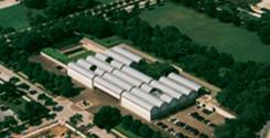 Commissioned
in 1966, Louis Kahn’s fabulous
building opened in 1972. It is a one
story design, comprised of 14 parallel vaulted segments, arranged with two
groupings of six vaulted segments each, flanking a four vaulted segment central
Commissioned
in 1966, Louis Kahn’s fabulous
building opened in 1972. It is a one
story design, comprised of 14 parallel vaulted segments, arranged with two
groupings of six vaulted segments each, flanking a four vaulted segment central
 group,
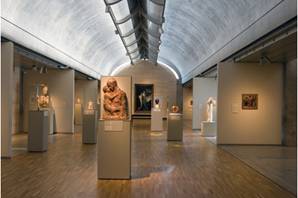
with the entrance in the set back. Each
segment is covered by a concrete barrel vault, 20 ft high, 100 ft long, 20 ft
wide—but cycloid in shape. (“The cycloid is the locus of a point on the rim of a circle
of radius rolling along a straight line.” From Wolfrom MathWorld; where a more complete
discussion can be found: http://mathworld.wolfram.com/Cycloid.html
) Each vault is split down the center
with a skylight, under the length of which runs a bird’s-wing shaped, pierced
aluminum
group,
with the entrance in the set back. Each
segment is covered by a concrete barrel vault, 20 ft high, 100 ft long, 20 ft
wide—but cycloid in shape. (“The cycloid is the locus of a point on the rim of a circle
of radius rolling along a straight line.” From Wolfrom MathWorld; where a more complete
discussion can be found: http://mathworld.wolfram.com/Cycloid.html
) Each vault is split down the center
with a skylight, under the length of which runs a bird’s-wing shaped, pierced
aluminum 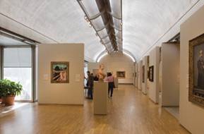 reflector, designed to diffuse the daylight from the
skylight onto the curved surface of the vault and thence softly into the
room. Kahn described his intentions in a
lecture given at the New England Conservatory of Music in 1969:
reflector, designed to diffuse the daylight from the
skylight onto the curved surface of the vault and thence softly into the
room. Kahn described his intentions in a
lecture given at the New England Conservatory of Music in 1969:
I felt
that the light in the rooms structured in concrete will have the luminosity of
silver. I know that rooms for paintings
and objects that fade should only most modestly be given natural light.
This
light will give a touch of silver to the room without touching the objects
directly, yet give the comforting feeling of knowing the time of day.
Light therefore becomes an active
part of the wonderful experience of the Kimbell. The silver illumination of the concrete
vaults is juxtaposed with the warmth of the travertine of the walls of the
galleries and the white oak trim
The ends of each vaulted section have a concrete band
between the vault and a lower cycloid arch below. This concrete band is pierced by a variable
height arched opening to the outside—higher in the center than at the bases,
formed apparently by a circular upper arch, over the cycloid one
beneath—punctuating the form with dazzling daylight. Some of the end sections (where there is no
other vaulted section behind, as in the one opening on the restaurant
courtyard, shown 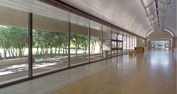 here to the left) have the space under the lower cycloid
arch filled in with glass, while most of the end pieces are opaque.
here to the left) have the space under the lower cycloid
arch filled in with glass, while most of the end pieces are opaque.
There are two courtyards—the
restaurant courtyard and a much smaller one on the opposite side of the
building, both un-vaulted and open to the sky.
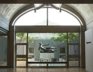
The entrance is a “green room,” with rectangular planters filled with
geometrically arranged trees that carry the architectural feel of the building
out to meet the green nature of the surrounding park. On each side  of the entrance itself are two long pools, constantly
overflowing with water.
of the entrance itself are two long pools, constantly
overflowing with water.
The outside of the building, while
successfully capturing the rhythm and form of its interior spaces, is not
nearly as completely satisfying as the totally pleasing and exciting
interior. It should also be strongly
noted that Kahn has created within his building an extremely successful space
in which to display and enjoy art—something that is not always the case in
museums.
And speaking of the art, the big
surprise was to find that there were some incredible paintings in the Kimbell’s collection.
One of the beauties of the Kimbell, is that
they display its collection sparingly—which greatly adds to its power, but
reduces the percentage of the collection that can be on display at any one
time. I am told that there are several
other world class masterpieces in the collection; but what follows is a
selection of the most noteworthy ones on display as of our visit (2 May
2009). It should also be noted that the
majority of the collection was not
all that spectacular.
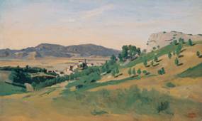
To begin with, there was a rather unusual—but
quite beautiful— Corot, View of Olevano,
1827 (Oil on paper affixed to canvas; at right) which
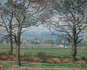 I was entranced by a lovely Pissarro, Near Sydenham Hill, 1871 (Oil on
canvas; at left). It was in many ways
typical of Pissarro; yet its palette was softer and less saturated then one
would typically expect—but in a completely pleasing way.
I was entranced by a lovely Pissarro, Near Sydenham Hill, 1871 (Oil on
canvas; at left). It was in many ways
typical of Pissarro; yet its palette was softer and less saturated then one
would typically expect—but in a completely pleasing way.
There was a Cézanne that captured both our attention. The painting, Maison
Maria with a View of Château 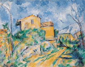 Noir, c. 1895 (Oil
on canvas; at right) was most unusual:
it was almost sketch-like in the openness of its brushstrokes; it was
particularly adventurous in its gestural use of color; and, while typical of
the master in its reduction of the forms of the buildings to more geometric abstraction,
and its moving them forward as flat areas on the surface of the painting, the
two structures on the right side of the painting were quite unusual in their
almost arbitrary form. I was a little
Noir, c. 1895 (Oil
on canvas; at right) was most unusual:
it was almost sketch-like in the openness of its brushstrokes; it was
particularly adventurous in its gestural use of color; and, while typical of
the master in its reduction of the forms of the buildings to more geometric abstraction,
and its moving them forward as flat areas on the surface of the painting, the
two structures on the right side of the painting were quite unusual in their
almost arbitrary form. I was a little 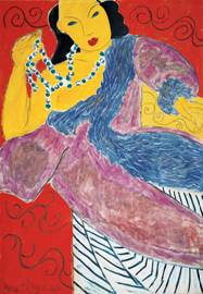 troubled by Cézanne’s handling of the central three
buildings: there was something disconcerting to me to the way they were
canted—probably some vestigial attempt to reflect the realistic effect of the
curvature and angle of the road rising around up the hillside on which the
buildings were sited; but that felt inconsistent with his abstract reduction of
the form for the painting. Nevertheless,
it is a most powerful and beautiful work.
troubled by Cézanne’s handling of the central three
buildings: there was something disconcerting to me to the way they were
canted—probably some vestigial attempt to reflect the realistic effect of the
curvature and angle of the road rising around up the hillside on which the
buildings were sited; but that felt inconsistent with his abstract reduction of
the form for the painting. Nevertheless,
it is a most powerful and beautiful work.
Finally, Matisse’s L'Asie, 1946 (Oil on canvas;
at left) was an interesting and satisfying painting of a type and period one
rarely sees in
All in all, the presence of great
painting like these added an unexpected degree of artistic pleasure to what we
had expected only to be an architectural experience.
Modern
Art Museum of Ft. Worth
(
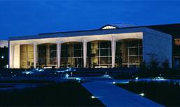
In 2002, Tadao Ando’s
magnificent building for the 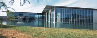 common
with its famous neighbor: its use of and
attention to indirect natural lighting, its use of concrete as its major
building material, its modernity, and its high level of aesthetic excellence. Nevertheless, in other ways it could not be
more different: whereas the Kimbell is small and intimate, Ando’s Modern is massive
common
with its famous neighbor: its use of and
attention to indirect natural lighting, its use of concrete as its major
building material, its modernity, and its high level of aesthetic excellence. Nevertheless, in other ways it could not be
more different: whereas the Kimbell is small and intimate, Ando’s Modern is massive 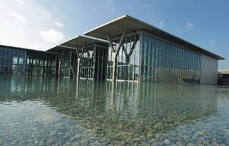 and
imposing; whereas the defining characteristic of the Kimbell
is the soft roundness of its ever-present cyclonic vaults, there are almost no
curves in the insistent flatness of the Modern; and whereas the solidly
enclosed spaces of Kahn’s Kimbell open out through
the walls in places to the outer world, Ando’s Modern is a structure of massive
concrete planes enclosed in surrounding 40 ft high walls
and
imposing; whereas the defining characteristic of the Kimbell
is the soft roundness of its ever-present cyclonic vaults, there are almost no
curves in the insistent flatness of the Modern; and whereas the solidly
enclosed spaces of Kahn’s Kimbell open out through
the walls in places to the outer world, Ando’s Modern is a structure of massive
concrete planes enclosed in surrounding 40 ft high walls 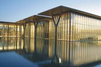 of
transparent glass. Yet both buildings
create a feeling of lightness: Kahn’s in
the spring created by its vaults, and Ando’s in the sense that the entire
structure seems to float on the 1.5 acre reflecting pond that surrounds it on
two sides. This effect is accentuated at
dusk or in the evening, when the light from inside makes the building glow atop
the reflecting pool.
of
transparent glass. Yet both buildings
create a feeling of lightness: Kahn’s in
the spring created by its vaults, and Ando’s in the sense that the entire
structure seems to float on the 1.5 acre reflecting pond that surrounds it on
two sides. This effect is accentuated at
dusk or in the evening, when the light from inside makes the building glow atop
the reflecting pool.
The northern section of the museum comprises three
rectangular areas, sheathed in glass, that protrude out into the reflecting
pond on their east ends—culminating in three Y-shaped concrete columns that
support the 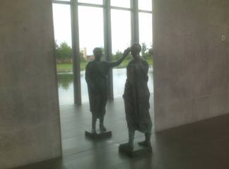 flat,
overhanging concrete roof slab. Most of
the display space is inside these rectangular concrete forms, but the museum
has very cleverly utilized the space between the glass curtain wall and the
flat,
overhanging concrete roof slab. Most of
the display space is inside these rectangular concrete forms, but the museum
has very cleverly utilized the space between the glass curtain wall and the 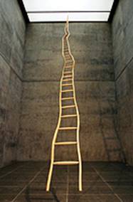 outer
concrete wall—through which there are visitor circulation patterns—for display
purposes, as, for example the marvelously placed sculptural work, “The
Etruscan (L'etrusco),” 1976, Bronze, mirror
at left). The statue faces an enormous
mirror on the concrete outer wall of the space, looking at and touching its own
reflection, with the glass curtain wall and the reflecting pool and park beyond
reflected behind it. The effect is
fantastic. Meanwhile, the two-story
interiors of these three protruding rectangular spaces are also used to good
effect: e.g., the clever and powerfully
positioned sculpture by Martin Puryear, Ladder for Booker T. Washington,
1996 (Wood [ash and maple]; at right), which can also be viewed from the second
floor interior balcony.
outer
concrete wall—through which there are visitor circulation patterns—for display
purposes, as, for example the marvelously placed sculptural work, “The
Etruscan (L'etrusco),” 1976, Bronze, mirror
at left). The statue faces an enormous
mirror on the concrete outer wall of the space, looking at and touching its own
reflection, with the glass curtain wall and the reflecting pool and park beyond
reflected behind it. The effect is
fantastic. Meanwhile, the two-story
interiors of these three protruding rectangular spaces are also used to good
effect: e.g., the clever and powerfully
positioned sculpture by Martin Puryear, Ladder for Booker T. Washington,
1996 (Wood [ash and maple]; at right), which can also be viewed from the second
floor interior balcony.
The main entrance to the museum offers no hint of what is to
come once 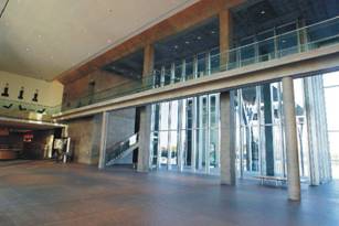 one
passes through to the far side of the museum.
Its interesting, but uninspiring southern façade opens into a very
successful and impressive expansive, high interior space; and it is only once
one has moved through to the glass wall at the far side of this space that one
becomes aware of the reflecting pool and the floating grandeur of the rest of
the museum beyond. It is a powerful
effect; but I cannot help but wonder whether it is worth losing the general
sense of the magnificent floating sides of the building. I think I should like to see that more
totally surround the building, and to have the entrance to the building be
through that. Actually, as things are
set up, many visitors never find their way to the grassy hill that forms the
park around the reflecting pool. All of
the pictures of the exterior of the building (all taken from the Museum’s
website), were taken from that park.
Nevertheless, one has to figure out the unmarked route through the
cafeteria to get out to this park, which seems quite odd.
one
passes through to the far side of the museum.
Its interesting, but uninspiring southern façade opens into a very
successful and impressive expansive, high interior space; and it is only once
one has moved through to the glass wall at the far side of this space that one
becomes aware of the reflecting pool and the floating grandeur of the rest of
the museum beyond. It is a powerful
effect; but I cannot help but wonder whether it is worth losing the general
sense of the magnificent floating sides of the building. I think I should like to see that more
totally surround the building, and to have the entrance to the building be
through that. Actually, as things are
set up, many visitors never find their way to the grassy hill that forms the
park around the reflecting pool. All of
the pictures of the exterior of the building (all taken from the Museum’s
website), were taken from that park.
Nevertheless, one has to figure out the unmarked route through the
cafeteria to get out to this park, which seems quite odd.
All this having been said, Ando’s building is a masterpiece.
And the Modern’s collection is full of masterpieces!
There was a superb paper piece by Jasper Johns, Target, 1958 (pencil, wash and
collage on paper mounted on 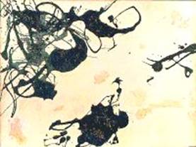 cardboard;
at right).
cardboard;
at right).
There were also spectacular drawings by Jackson Pollock, but unfortunately there were no images of them
available online. Among the Pollock
paintings, however, was this unusual but wonderful collage, Untitled
(Collage I), c. 1951 (Enamel, silver paint, and pebbles on illustration
board; at left).
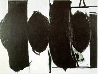
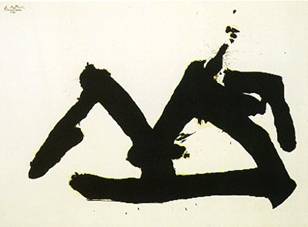
There were a surprising number of great paintings by Robert Motherwell. Two terrific examples are Stephen's Iron Crown, 1981 (Acrylic on oil-sized canvas; at left below) and Elegy to the Spanish Republic, 1960 (Boucour Magna paint on canvas; on right below)
There is a simply sublime painting by Mark Rothko, Light Cloud, Dark Cloud, 1957 (Oil on canvas); but, unfortunately, the online image of it is so bad—and its color and subtleties so painfully distorted—that I cannot bear to reproduce it here. It was, perhaps, our very favorite work of art in the Modern.
Among the other treasures of this fantastic place were an  unusual
but great Diebenkorn,
unusual
but great Diebenkorn,
Amon Carter Museum (3501 Camp Bowie Boulevard, Fort Worth, TX 76107, tel: 817.738.1933)
 On the other side of the Kimbell
from the Modern is The Amon Carter
On the other side of the Kimbell
from the Modern is The Amon Carter 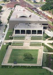 Museum, a building that consist of a
1961 original small building at the front of the museum, designed by Philip Johnson, and a 50,000 ft2
addition behind the original section, by Johnson, completed in 2001.
Museum, a building that consist of a
1961 original small building at the front of the museum, designed by Philip Johnson, and a 50,000 ft2
addition behind the original section, by Johnson, completed in 2001.
The 1961 part of the building is
a loggia constructed of Texas shellstone, with
slender columns of triangular cross-section, that increase in width as they
rise from the ground level to the slightly curved tops of the five open bays
that they create. (Because of the slender shape of the columns and the fact
that they come almost to a point at their bottoms, they were derided as being “en pointe,”
and the style of the building unaffectionately was
referred to as “ballet modern.”) Behind
this almost completely open façade is a curtain wall of tinted glass in bronze
mullions—definitely a reference to the 1958 Seagram Building of Mies van der Rohe,
in which Philip Johnson collaborated.
Inside the curtain wall, Johnson created a two-story high entrance hall,
with a warm teak wall articulated with 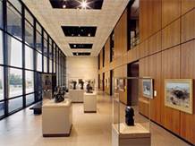 bronze
trim on the far side. In the original
plan, there was a line of five small galleries on the first floor behind the
teak wall, and a row of four offices and a library on the floor above the
galleries. This originally was the
entirety of the Amon Carter. Within three years, the
museum needed to expand, and an addition was built behind the original Johnson
structure; and in 1977 another, still larger addition was constructed. A dozen years later, it was decided to close
the museum and do a major rebuilding to triple the museum’s size. Philip Johnson was hired to do the new
building, and
bronze
trim on the far side. In the original
plan, there was a line of five small galleries on the first floor behind the
teak wall, and a row of four offices and a library on the floor above the
galleries. This originally was the
entirety of the Amon Carter. Within three years, the
museum needed to expand, and an addition was built behind the original Johnson
structure; and in 1977 another, still larger addition was constructed. A dozen years later, it was decided to close
the museum and do a major rebuilding to triple the museum’s size. Philip Johnson was hired to do the new
building, and 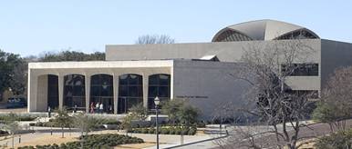 everything
was torn down except for his 1961 structure, which was preserved virtually
intact, except for the redesigning of the second floor offices as galleries,
each with a balcony overlooking the main hall (the image of the entrance hall
at the left is of the current arrangement, and the openings of the galleries
can be seen in the second floor of the teak wall). In 2001, the Amon
Carter reopened in its present form (image at right). While it is not particularly beautiful or
successful from the outside, the new structure provides copious and attractive
gallery space. The most beautiful
element of the new building is its spacious, open central atrium: two stories high, it is topped with a
flattened, slightly pointed, groin-vaulted dome, with ample openings at the end
of each vault which admit sunlight from outside.
everything
was torn down except for his 1961 structure, which was preserved virtually
intact, except for the redesigning of the second floor offices as galleries,
each with a balcony overlooking the main hall (the image of the entrance hall
at the left is of the current arrangement, and the openings of the galleries
can be seen in the second floor of the teak wall). In 2001, the Amon
Carter reopened in its present form (image at right). While it is not particularly beautiful or
successful from the outside, the new structure provides copious and attractive
gallery space. The most beautiful
element of the new building is its spacious, open central atrium: two stories high, it is topped with a
flattened, slightly pointed, groin-vaulted dome, with ample openings at the end
of each vault which admit sunlight from outside.
We did not expect to find any art we were interested in the Amon Carter’s collection, as it specializes in the art of the American West. Nevertheless, there was a show in progress entitled “High Modernism: Alfred Stieglitz and his Legacy,” which contained some wonderful photographs. While there actually were few Stieglitz photos in the exhibition, one of the ones in it was so sublime as to have made seeing it alone worth a trip to the museum.
And—last but certainly not least—was our lunchtime excursion to that pinnacle of Mexican food in this town renowned for this cuisine:
Joe
T. Garcia’s (
Now this homey, friendly place was extraordinary! It seats over 1,000—and it does a rip-roaring business. I am told there is a beautiful garden in which to eat, but it was raining while we were there, so I did not notice. What I did notice, however, was the food: it was totally delicious. We sampled a lot of dishes, and, while all of them were good, some of them were spectacular: our favorites were the Beef Chile Relleños (the best I’ve ever had anywhere), and the Chimichangas (an intensely delicious treat). It’s inexpensive and wonderful. What more could one ask for?
Our day spent walking in
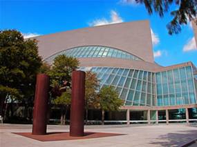
Nasher Scupture Center (
In a way reminiscent of Louis
Kahn’s  barrel-vaulted
bays. In the case of the Nasher, there are only
barrel-vaulted
bays. In the case of the Nasher, there are only  five
bays, each of them running the entire length of the building; and the vaults
are shallow—springing from a height of 16 ft. from the floor, but rising only 1
ft. higher at their midpoints. Like the Kimbell, the Nasher’s galleries
are illuminated by cleverly diffused natural light, in the Nasher’s
case produced using a novel suspended glass ceiling, with a cast aluminum sun
screen above to filter the sunlight—and all but eliminating the need for
artificial lighting q.v., detail at
right). The walls of the building are
made from Italian travertine. The ends
of each of the bays are made of clear glass, which allows the interior space
visually to connect with the outdoor ones—and, in particular, integrating the
five bays with the beautiful, tree-lined garden behind the museum, also laid
out in long, parallel, rectangular sections.
At the far end of the garden, positioned
five
bays, each of them running the entire length of the building; and the vaults
are shallow—springing from a height of 16 ft. from the floor, but rising only 1
ft. higher at their midpoints. Like the Kimbell, the Nasher’s galleries
are illuminated by cleverly diffused natural light, in the Nasher’s
case produced using a novel suspended glass ceiling, with a cast aluminum sun
screen above to filter the sunlight—and all but eliminating the need for
artificial lighting q.v., detail at
right). The walls of the building are
made from Italian travertine. The ends
of each of the bays are made of clear glass, which allows the interior space
visually to connect with the outdoor ones—and, in particular, integrating the
five bays with the beautiful, tree-lined garden behind the museum, also laid
out in long, parallel, rectangular sections.
At the far end of the garden, positioned  perpendicular to the
garden’s longitudinal axis, are two long, narrow fountains, articulated with a
line of 2 ft. high jets of water; and behind the fountains is a sequence of
terraced plantings.
perpendicular to the
garden’s longitudinal axis, are two long, narrow fountains, articulated with a
line of 2 ft. high jets of water; and behind the fountains is a sequence of
terraced plantings.

The garden contains a wealth of marvelous sculptures.
One of the most unusual aspects
of the Nasher’s collection is the number of
sculptures it has by Willem de Kooning. As
familiar as we are with de Kooning’s paintings, his
sculptures were relatively new to us.
(De Kooning turned to sculpture only in his
later years, after having settled in East Hampton on
The garden contains a very
effective momumental Richard Serra sculpture, My Curves Are Not Mad, 1987 Cor-Ten
Steel (two inwardly curving steel plates), and a quite beautiful Aristide 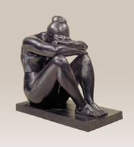 Maillol, Night
(La Nuit), ca. 1902-09 (cast 1960)
Bronze (at left).
Maillol, Night
(La Nuit), ca. 1902-09 (cast 1960)
Bronze (at left).
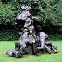
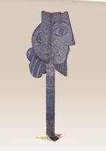
There is also a whimsical Picasso sculpture, Head of a Woman (Tête de femme), 1958 Gravel and concrete (at right), which I found to be delightfully reminiscent of Picasso’s pottery.
At the end of the garden, behind the terraced plantings, there is a granite path sloping inward toward the cross-sectional center of the garden, and descending to the entrance to one of the more creative and unusual sculptures in the Nasher, a “Skyscape,” by James Turrell, entitled, Tending, (Blue).
Here is the description the Nasher has on its website:
In the 1970s, James Turrell began a series of works that he describes generically
as "skyspaces." These are enclosed spaces -
rooms or ") free-standing
structures - open to the sky through rectangular or circular apertures in the
roof. While they appear to be architectural in nature, these spaces exist
solely to create the light effects and perceptual events that constitute Turrell’s art. This skyspace, Tending, (Blue), was commissioned as a site-specific project for the
free-standing
structures - open to the sky through rectangular or circular apertures in the
roof. While they appear to be architectural in nature, these spaces exist
solely to create the light effects and perceptual events that constitute Turrell’s art. This skyspace, Tending, (Blue), was commissioned as a site-specific project for the
Nestled in a planted berm at the northern end of the sculpture garden Tending,
(Blue) is housed in a structure of rough hewn black granite blocks and
contains two independently functioning, yet related, components: the ") entrance vestibule and the skyspace.
entrance vestibule and the skyspace.
The skyspace
provides a quiet, meditative setting in which one concentrates on the view of
the sky through a 9 ½ x 9 ½ ft. opening in the ceiling. The rim of the
aperture is knife-edge thin, which helps heighten the perception of the sky’s
proximity. It often appears that the sky has been drawn like a sheet
tightly across the opening. Italian limestone benches line the interior
plaster walls of the skyspace. They are heated
during the winter, and the ") skyspace is
air-conditioned in warmer months, providing a comfortable viewing environment
year round.
skyspace is
air-conditioned in warmer months, providing a comfortable viewing environment
year round.
Washing the interior walls of the skyspace with various combinations of red, green, blue, and
yellow light, Turrell conditions the eye in a way
that affects one’s perception of the sky’s color, distance, and density.
The sky seems to take on extraordinary colors and, framed by the knife-edge rim
of the aperture, appears extremely dense and flat. At sunrise and sunset,
when changes in the coloration of the sky are most rapid and pronounced, the  experience
can be especially mesmerizing. Just before sunrise, the lights inside the
skyspace begin to change gradually, slowly shifting
the perceptible hues and tones. At sunset the changes are more dramatic,
eliciting vibrant colors and sharper contrasts. The light program becomes
more active after sunset, cycling now more rapidly through a variety of colors,
some seemingly impossible. The entire system is coordinated by an
astrological clock that constantly monitors the changing times of sunrise and
sunset at the specific geographic location of the skyspace.
The interior lights of the skyspace do not normally
change between sunrise and sunset. However, if a photo sensor registers
the external ambient light below a certain level during this period, it
triggers a brief, quickly paced "storm" cycle of saturated colors and
abrupt lighting changes.
experience
can be especially mesmerizing. Just before sunrise, the lights inside the
skyspace begin to change gradually, slowly shifting
the perceptible hues and tones. At sunset the changes are more dramatic,
eliciting vibrant colors and sharper contrasts. The light program becomes
more active after sunset, cycling now more rapidly through a variety of colors,
some seemingly impossible. The entire system is coordinated by an
astrological clock that constantly monitors the changing times of sunrise and
sunset at the specific geographic location of the skyspace.
The interior lights of the skyspace do not normally
change between sunrise and sunset. However, if a photo sensor registers
the external ambient light below a certain level during this period, it
triggers a brief, quickly paced "storm" cycle of saturated colors and
abrupt lighting changes.
Turrell has programmed 10 different light cycles for the skyspace and is planning a total of 12. With such a variety of lighting cycles playing against constantly changing atmospheric conditions, Tending, (Blue) displays a seemingly endless variety of moods and experiences.
The Turrell Tending, (Blue) is amazingly successful: it creates a powerfully orchestrated experience, culminating in the skyscape room itself, where the knife-edged square cutout in the ceiling is visually intense in a way that is hard to describe and difficult even to imagine. Even once I knew what it was (which did not happen for some time), I could not believe it was simply a void in the ceiling; it much more appeared to be some intensely lighted square of frosted glass.
And while the collection at the Nasher far exceeds the museum’s capacity to display at any one time, the art on display in the gallery during our visit was diverse and wonderful.
There were a number of fantastic small de Kooning sculptures: for example, his delightful Clamdigger, 1972 Plaster (at left). There was also a very satisfying late painting, Untitled IX, 1984 Oil on canvas (at right), which is a terrific example of his late style.
There were a pair of interesting Giacometti nudes; a lot of sculptures by David Smith—some wonderful, many good, some not (and the painting of his typically bad); a great Lichtenstein, Double Glass, 1979-80 Painted and patinated bronze; and an excellent Calder mobile, The Spider, 1940 Painted sheet metal and steel rod.
There were three fabulous small Matisse sculptures, two of which were particular standouts: Large
Seated 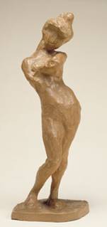 Nude (Grand Nu assis),
1922-29 (cast 1952) Bronze (at left), and Madeleine I, 1901 (cast 1903) Painted plaster (at
Nude (Grand Nu assis),
1922-29 (cast 1952) Bronze (at left), and Madeleine I, 1901 (cast 1903) Painted plaster (at 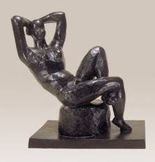 right).
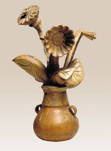
Picasso’s Flowers in a Vase (Fleurs dans
un vase), 1951-53 Painted plaster, terracotta and iron (below, left) was a great example of the joyful
exuberance of his pottery style.
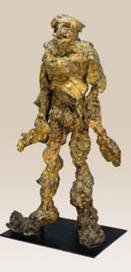
And finally, there was a very successful and very unusual Chamberlaine, Zaar, 1959 Welded steel, painted (below, right)—much more open and “un-compacted” than most of his works.

The Morton
H. Meyerson Symphony Center (2301 Flora St. Dallas, TX 75201 tel: 214.670.3600)
Opened in 1989, The
Morton H. Meyerson Symphony Center is an elegant,
open building by I. M. Pei. While the plan’s underlying structure is
founded on his more typical rectilinear forms,
Pei relies more heavily here on
curving forms and spaces than he usually employs, giving the building an
organically expansive feel in a most successful way. As
The plan of the 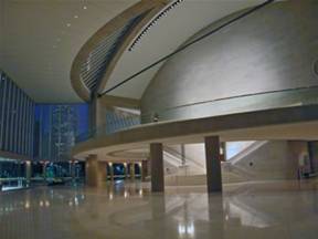 enveloped by segments of circles. The
central rectangular form houses the performance hall. Surrounding it, under a
sweeping glass canopy, are various layers of programmed and unprogrammed
public space, including an expansive skylit lobby, a
garden court restaurant and sculpture garden. The total structure is tilted
toward the skyline to establish a visual connection with the city's emerging
enveloped by segments of circles. The
central rectangular form houses the performance hall. Surrounding it, under a
sweeping glass canopy, are various layers of programmed and unprogrammed
public space, including an expansive skylit lobby, a
garden court restaurant and sculpture garden. The total structure is tilted
toward the skyline to establish a visual connection with the city's emerging 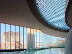 Arts District and with
The building program required a design that would accommodate two
different, but related, functions. Of paramount importance is the performance
hall.
In contrast to the necessarily closed character of the performance
hall, the surrounding public areas are transparent by day and night, offering
an inviting place to congregate when performances are not in progress. These
intricately glazed spaces have been designed to provide visual excitement
through the manipulation of light, movement, and changing perspectives. In this
way, the
The 50 ft. high Grand Lobby is filled with light from the
huge conic windows
The 85 ft. high concert hall itself, which seats just over
2,000 people, is an interesting combination of traditional and modernist: its overall shape and feel is that of a
classic, 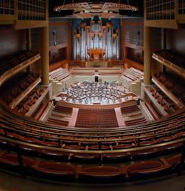 shoebox
symphony hall, but there are many modern elements and touches—particularly in
the warm wood panels of African and American cherry used in many places
throughout the hall. There are
acoustical canopies over the orchestra which are adjustable to the varying
requirements of symphonic music as well as smaller performances. In
shoebox
symphony hall, but there are many modern elements and touches—particularly in
the warm wood panels of African and American cherry used in many places
throughout the hall. There are
acoustical canopies over the orchestra which are adjustable to the varying
requirements of symphonic music as well as smaller performances. In
Its forms and shape are the result of rigorous adherence to the acoustician's requirements for audience distribution, unobstructed sight lines, and acoustical excellence. Seating 2,062 people on four levels, the concert hall focuses on the performance platform and on the grand concert organ.
The space almost works well: it is an appealing combination of warm and soothing on the one hand, and stimulating and visually exciting on the other. Unfortunately, I ultimately found it far too busy and over-detailed to work for me. And there were certain details, like the over-abundance of large bright brass head rails on all the balconies, that felt almost tacky, in a Donald Trump sort of way.
Our Walking Tour of Downtown
Nancy and I spent a few hours walking the streets of downtown (and into the Historic District), before heading for
the Arts District. Here are some of the buildings we liked, in
the order of our walking tour—which began from in front of the Dallas Museum of Art, headed south as
far as the Magnolia Building, then
looped west to Bank of America Plaza,
and north past Fountain Place to the
Hunt Consolidated Tower, and back to
the Nasher Sculpture Center. You may note that there are an incredible
number of buildings by I. M. Pei &
Partners (since 1989, Pei Cobb Freed
& Partners) in
 Situated on a nearly triangular block, two sides of this
surprisingly pleasing 45 story building have flat surfaces that follow the line of the streets
they face, while the hypotenuse side—which is beveled into nine window bays
that run the height of the building and give a satisfying texture when
juxtaposed to the smoothness of the other two sides—is on a more acute angle
than Akard street, which it faces, and the building
actually comes to a point at its northern end, whereas the site itself is
blunted at that end. HKS
of
Situated on a nearly triangular block, two sides of this
surprisingly pleasing 45 story building have flat surfaces that follow the line of the streets
they face, while the hypotenuse side—which is beveled into nine window bays
that run the height of the building and give a satisfying texture when
juxtaposed to the smoothness of the other two sides—is on a more acute angle
than Akard street, which it faces, and the building
actually comes to a point at its northern end, whereas the site itself is
blunted at that end. HKS
of
Energy Plaza 1601 Byran Street,
1983
Located just north of
Thanks-Giving Square, this 49-story building by I. M. Pei & Partners
consists of three triangular structural sections at different heights: at the
base there is a 6 story high structure; the main body of the building then rises
as an equilateral triangle to 43 stories; with a final triangular shaft rising
another six floors higher. On the north side a vertical notch
carved into the tower rises to the 43rd floor.
It is OK—especially compared to some of the other really bad buildings
around
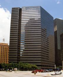
This rather large, bulky, 30 story
building by I. M. Pei & Partners is actually far more pleasing than
one might expect of such a massive volume. It is diamond shaped, and it has two
V-shape vertical notches, which—while I usually do not like such
contrivances—in this case create some interest and balance to an otherwise
plain form—particularly as they play against the strong horizontal pattern of
the articulation of the exterior surface of the building by the bands of the
continuous tinted glass windows.
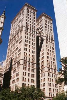
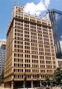 Kirby Building
 1509 Main Street
Shortly
after the completion of the Adolphus Hotel,
Adolphus Busch hired the St. Louis firm of Barnett, Hayes, & Barnett (the same
firm that did the Adolphus)to design this 17 story
Gothic Revival early Dallas skyscraper, one block from the hotel to serve as an
office building for the hotel. Originally named the
Adolphus Hotel 1321 Commerce Street, 1912; additions 1916, 1926, 1950; restored
1981
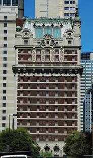 Adolphus Busch (of the Anheuser-Busch Brewing Association) built
this 20 story hotel, which opened in 1912. Designed by the
Adolphus Busch (of the Anheuser-Busch Brewing Association) built
this 20 story hotel, which opened in 1912. Designed by the
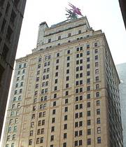 The Magnolia Building
1401 Commerce Street, 1922
The Magnolia Building
1401 Commerce Street, 1922
 When
this 29 story Renaissance Revival building was completed in 1922, it was one of
the tallest buildings west of the
When
this 29 story Renaissance Revival building was completed in 1922, it was one of
the tallest buildings west of the 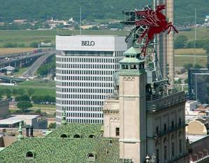 Hotel.
A giant version of the corporate
logo of the Magnolia Petroleum Company, Pegasus, a giant flying red horse,
attached to a 50 ft. high metal tower
resembling an oil derrick, and brightly lit at night, was
placed atop the Magnolia Building in 1934.
It quickly became the most famous icon of the city, a landmark beloved
by all.
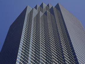
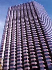
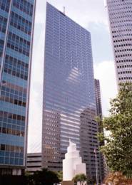
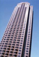
Bank of
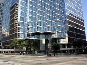
At 921 ft. and 72 stories, the BOA Plaza Building is the tallest
skyscraper in
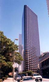
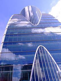
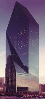 Fountain Place (originally Allied Bank Tower)
1445 Ross Avenue, 1986
Fountain Place (originally Allied Bank Tower)
1445 Ross Avenue, 1986
 Our favorite skyscraper in Dallas, Fountain
Place was designed by my Urban Age
friend, Harry Cobb of I.M. Pei and
Partners (since 1989, Pei
Cobb Freed & Partners).
Our favorite skyscraper in Dallas, Fountain
Place was designed by my Urban Age
friend, Harry Cobb of I.M. Pei and
Partners (since 1989, Pei
Cobb Freed & Partners).
From the description on the Pei Cobb Freed & Partners website, in order to create for the client, “both a unique
identity on the skyline and an inviting public presence at street level,” the
firm came up with the following:
The
solution takes the form of a glazed prism informed by a rigorous and precise
geometrical procedure employing the diagonal of a double square in plan and
section. The resulting skyscraper contains office floors of 36,000 to 1,500
s/f, with an average of 21,000 s/f. At the tower's base, half of the building
volume is carved away up to a height of sixty feet, allowing the water garden
with its ordered forest of bald cypress trees to flow through beneath. This
eventful garden, designed by the landscape architect Dan Kiley,
is the essential heart of
The 60-story, 1.3-million ft2 office
tower is clad in green glass, and its appearance changes depending on the
vantage 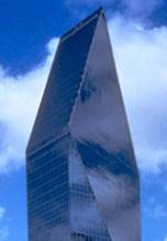 point
from which it is
point
from which it is 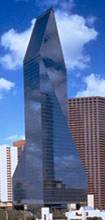 viewed. This sculpted prism-- Harry Cobb as described
it as “What's left after carving into a square prism”—begins as a parallelogram in plan at the ground level, becomes a
square on levels 6-13, and, beginning at the level of the 14th
floor, has two huge triangular sections on opposite sides of the building which
are cut into the building’s volume, gradually sloping upward and inward, and
ending at a point from which the gabled roof of the upper stories springs. At the apex of the structure, in between its
two gables’ ends, is a central ridge line.
Overall, it is a rich, graceful, and vibrant form, exhibiting a feeling
of novelty and change, but with a high degree of balance and stability. Both Nancy and I felt ourselves wishing that
the gables were not isosceles
triangles (they may even be an
equilateral ones, I do not know)—feeling that asymmetry in this roof feature
would have been far superior, and would have been a solution that would have
been both richer and actually more in keeping with the richness of the
experience of the building. (Of course,
in deference to the architect, the sides of the gables often appear in the ever changing experience
viewed. This sculpted prism-- Harry Cobb as described
it as “What's left after carving into a square prism”—begins as a parallelogram in plan at the ground level, becomes a
square on levels 6-13, and, beginning at the level of the 14th
floor, has two huge triangular sections on opposite sides of the building which
are cut into the building’s volume, gradually sloping upward and inward, and
ending at a point from which the gabled roof of the upper stories springs. At the apex of the structure, in between its
two gables’ ends, is a central ridge line.
Overall, it is a rich, graceful, and vibrant form, exhibiting a feeling
of novelty and change, but with a high degree of balance and stability. Both Nancy and I felt ourselves wishing that
the gables were not isosceles
triangles (they may even be an
equilateral ones, I do not know)—feeling that asymmetry in this roof feature
would have been far superior, and would have been a solution that would have
been both richer and actually more in keeping with the richness of the
experience of the building. (Of course,
in deference to the architect, the sides of the gables often appear in the ever changing experience  of the building to be of unequal length—and that may
ultimately be truer to the way the structure works.) The building powerfully commands a visual
place in the
of the building to be of unequal length—and that may
ultimately be truer to the way the structure works.) The building powerfully commands a visual
place in the
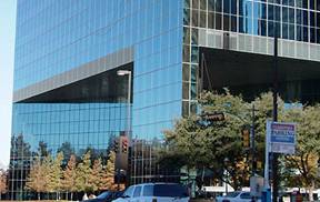
There are two very effective
entrances to the building, created by undercutting its north and south corners
(q.v., 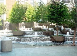 image at type left of the description). The triangular shape created above each
entrance is strongly punctuated by the glass-clad “leg” which the building
seems to place down to root itself—to “take a stand”— at the apex of each
overhang; and the height and scale of each opening announces a monumental
importance to the building one is about to enter. Both entrances are approached through plazas
containing a series of descending pools and waterfalls, highlighted by bald cypress
trees, positioned in round concrete planters.
The
image at type left of the description). The triangular shape created above each
entrance is strongly punctuated by the glass-clad “leg” which the building
seems to place down to root itself—to “take a stand”— at the apex of each
overhang; and the height and scale of each opening announces a monumental
importance to the building one is about to enter. Both entrances are approached through plazas
containing a series of descending pools and waterfalls, highlighted by bald cypress
trees, positioned in round concrete planters.
The 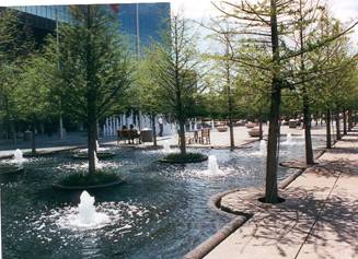 organic and biological feel of these wonderful plazas
(designed by landscape architect Dan Kiley)—with their trees, water, and rounded
forms—create a marvelous counterpoint to the flatness and shiny modernity of
the building itself. They also create an
inviting and relaxing environment in which for people to
congregate—particularly in the larger, flatter expanse of the northern entrance
plaza. The only slight quibble I have
with the lower floors of the building is that inside the impressive height of
the glass entrance wall, the lobby itself does not fully rise to its height;
but rather the upper floor is filled in with a series of glass-cornered
offices, the points of which go right up to the curtain wall of the
entrance—creating and overhand that diminishes the grandeur of the lobby.
organic and biological feel of these wonderful plazas
(designed by landscape architect Dan Kiley)—with their trees, water, and rounded
forms—create a marvelous counterpoint to the flatness and shiny modernity of
the building itself. They also create an
inviting and relaxing environment in which for people to
congregate—particularly in the larger, flatter expanse of the northern entrance
plaza. The only slight quibble I have
with the lower floors of the building is that inside the impressive height of
the glass entrance wall, the lobby itself does not fully rise to its height;
but rather the upper floor is filled in with a series of glass-cornered
offices, the points of which go right up to the curtain wall of the
entrance—creating and overhand that diminishes the grandeur of the lobby.
But, in summary, this is one
terrific building!
Hunt Consolidated Tower 1900 Akard Street,
2007
 This new 15 story building,
designed by TBG,
This new 15 story building,
designed by TBG,
 effective particularly in
juxtaposition to the softer horizontal convex curves of its western façade, the
impact of which, while far more subtle with respect to their shape, is visually
intensified by the horizontal lines of their gray spandrels. The idea of piercing the convex northern
façade with a vertical cylinder is interesting, but ultimately not
successful—although it does create what appears to be an effective interior
volume inside the lobby of the building.
(I cannot say for sure, however, as we were unable actually to get
inside to see it.) Unfortunately, the
east side of the building is basically a plain, flat recreation of the
beautifully curved western face—and it fails miserably to maintain itself as
part of the overall design.
effective particularly in
juxtaposition to the softer horizontal convex curves of its western façade, the
impact of which, while far more subtle with respect to their shape, is visually
intensified by the horizontal lines of their gray spandrels. The idea of piercing the convex northern
façade with a vertical cylinder is interesting, but ultimately not
successful—although it does create what appears to be an effective interior
volume inside the lobby of the building.
(I cannot say for sure, however, as we were unable actually to get
inside to see it.) Unfortunately, the
east side of the building is basically a plain, flat recreation of the
beautifully curved western face—and it fails miserably to maintain itself as
part of the overall design.
The landscaping created by TBG is quite
successful. There is a fountain and infinity edge
reflecting pool that wraps around the front of the building, and these water
elements are juxtaposed with desert plantings for a most entrancing
effect. The narrow plaza around the
building is also dotted with bald cypress trees and massive live oaks, which
restores a sense of fertile balance to the area.
Trammell Crow Center 2001 Ross Avenue, 1984
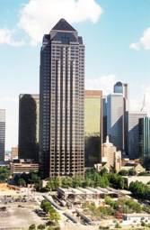 The
final building on our walk, just opposite the south side of the
The
final building on our walk, just opposite the south side of the
At street level, the building is
surrounded with landscaping which includes numerous tall trees a sculpture
garden. On the north side of the tower is a two floor pavilion which
houses the Crow Collection of Asian Art. The entrance through the Crow
Collection building—up an attractive flight of stairs with a small, descending
fountain of running water (not unlike an extremely miniaturized version of the
stair-fountain at Villa Lanta, near Viterbo, in Italy)—works nicely, and leads one into the
rather grand, high ceiling lobby of the building (which would be far more attractive,
however, with less gaudy trim—especially the polished brass).
And, finally, my restaurant
suggestion (the one place we ate in
Local
(
Located in the funky, gentrifying
neighborhood of Deep Ellum, Local was an amazing find.
It is in the old
But it is the food that makes Local so special. It is basically American cuisine, with an
ever-so-subtle Southwestern character.
Chef Tracy Miller clearly has many classic culinary influences—and
knowledge; but the preparations she creates are clearly contemporary. She clearly uses only the best and freshest
ingredients, and combines them in ways that are both clear and balanced. From the petite soup amuse, to the cranberry
thumbprint before leaving, everything was delicious. Local clearly deserves the fact that it has
the highest “Food” rating score in the Dallas Zagat’s.